I revamped the payment experience of Venmo app to enhance convenience and safety for current and potential users.
Venmo Redesign
Mobile App Design
FinTech


Timeline
Half Semester
Tools
Figma
Miro
My Role
Desk & Market Research
UX Research & Design
UI Redesign
Individual Project
Instructor:
Susanna Zlotnikov
Experience Innovation
49716 - Fall 22
Why this Redesign?
What’s Venmo
Venmo is a mobile payment service that helps people pay, request, and transfer money. It places a lot of emphasis on its social networking functions: It allows users to make transactions public, through which others can comment, and like in the homepage.
Reviews from users
By reviewing the comments at app store, I found that some users are confused and feel unsecured when making transactions.
GabrielRSRocha
Good app, with flaws
"Could you guys make this more secure? We are handling money after all. The social component is cool, ...[but] to have your financial life aired out like that is quite strange."
dan Meulenberg
"The idea that you have to choose a privacy setting to keep your transfers hidden from the general public seems insane. It appears the default setting is for exposure of all transactions to the general public..."
Summary
Safety concerns exist when transferring online, such as data breaches, theft brush, bankruptcy, etc.
Elder users find it difficult to make a payment online.
Uncertainty about third-party information may cause a reluctance to use certain payment methods.
Sometimes it is too complicated to find the information on how I can remove unnecessary steps/fees.
Methodology
Exploring the official website of Venmo(i.e., FAQs) to see if there are any pain points
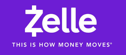
Analyzing other popular payment methods(i.e., Zelle, PayPal, Ali pay) with SWOT analysis
Exploring the online/mobile payment topics on Quora
Observing bank/ATM users and comparing them with online ones
Desk Research
Design Process
Desk Research
& Observation
Interveiws & User Journey
Brainstorm
Wireframe
Validation & Refinement
1
2
3
4
5
Competitive Analysis
I researched the key functions of 4 popular apps that are used in different regions:
Zelle has been more widely accepted because of its cooperation with banks and eases to use.
WeChat pay and Alipay embedded transactions into the message function, which is a more natural environment for users to pay/request.
Apple pay has a very nice interaction: Using the digital wallet to pay, and tapping like on the real card machine forms a highly competitive advantage.
-
+
SOCIAL
EASY TO USE
FUNCTIONAL
EASY TO USE


Interviews & User Journey
Frequency of using online payment Apps
1 per 3 days
Other preferred Apps
Wechat Pay, Zelle
Feeling of insecure
N/A
Participant A
Age: 22
Gender: Male
Participant B
Age: 40+
Gender: Female
Frequency of using online payment Apps
1 or 2 times per week
Other preferred Apps
Paypal, Zelle
Feeling of insecure
Felt unsafe seeing everyone’s transaction historys
Steps
User Actions
Emotions
Pain points
Sign In/Sign Up
Add a bank or card
Transfer money
Pay / Request Money
Finish Payment
- Users with 0 money in their account still have access to the transferring page.
- The word “transfer money” might be confusing.
Click on the Transfer Money Button at the Profile page to withdraw money from Venmo to bank account
Neutral
Slightly smilling: finish the first step
- Enter user name/password
- Enter background Information
- Create an account
Too many steps needs to be completed
- Add existing card as payment methods
- Or Add your card instead
Finally deleted the app after the 3-times failures of adding cards/banks on Venmo
- Requested payment can not be canceled
- Request could not be notified as your friends confirm/decline
- The request and pay button are so close
Users need to confirm the last 4 digits of the phone number for the 1st time
- Click Pay and Request button
- Enter the amount and notes
- Select pay or request
- Confirm payments/request
PAY: Receive notifications of successful payments
REQUEST: waiting for others to pay money back
Slightly frowning: failed to add for times
Slightly frowning: too many confusions
Canot find where to see the requested payment
Happy: complete all steps & receive the money
Concept
After brainstorming (Creative & Positioning Matrix, etc.), I narrowed down to the following two ideas because they are the most relevant and have more impact on transaction.
Concept 1: Messages
A new feature that allows users to chat and make transactions through messages.
Concept 2: Payment Use Flows Redesign
Separate the request feature with payment and design a more intuitive UI that creates engagement

This is the payment today
Thanks! Have a good night
Pay / Request / Transfer
Onboard
Privacy
Enablers
HMW statement
Tap phones to pay: just like a tap on a card machine ( e.g. Apple Pay )
Add Venmo to your digital wallet
Find people nearby to send money quickly
Pushes: Receive the requested payment
Messages between friends: Insert notifications into a new feature
Sound notification for money/transaction going in “Cha-ching”, going out “whomp whomp”
Use a unique transaction code for each payment
Verification page after successful payments
Make it more obvious: change the privacy of viewing others’ transactions
Verification: Face recognition payment system
QR code to onboard directly to a friend
Set up with any phone number/country/email that allows global transfer
Venmo wallet partnering with businesses: Build into budget/transaction/banking Apps
a table where financial literacy reps create a scenario and walk them through transactions
Ideas that I like
I reorganized the overall brainstorming process in class and decided to use only one HMW statement as it's more efficient for me to address problems. I also placed the onboarding experience as my third enabler to make it more concise.
Creative Matrix
Ideation
How might we create a convenient and safe transaction experience for Venmo users?
Opportunity
Desk Research
Obeservations
Interviews
1
2
3
Safety concerns exist when transferring/paying online.
Misunderstanding of the transfer, pay, and request functions.
Needs for reducing transaction time and downgrading the social page


Add from friends/Recent
Click on specific person to pay
Successfully paid: alerts through firework animations
Open chat in Message
Click on the plus sign at the bottom to pay/request
Enter the number, notes, and privacy for transaction
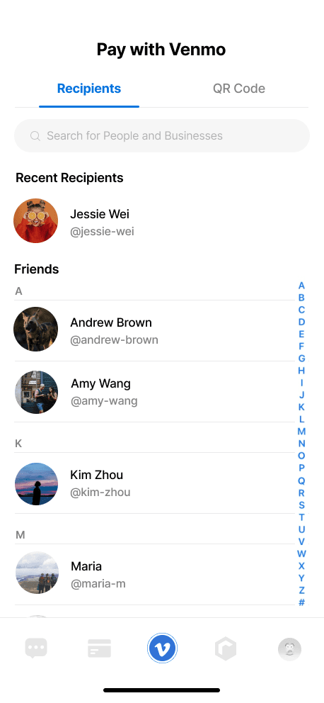
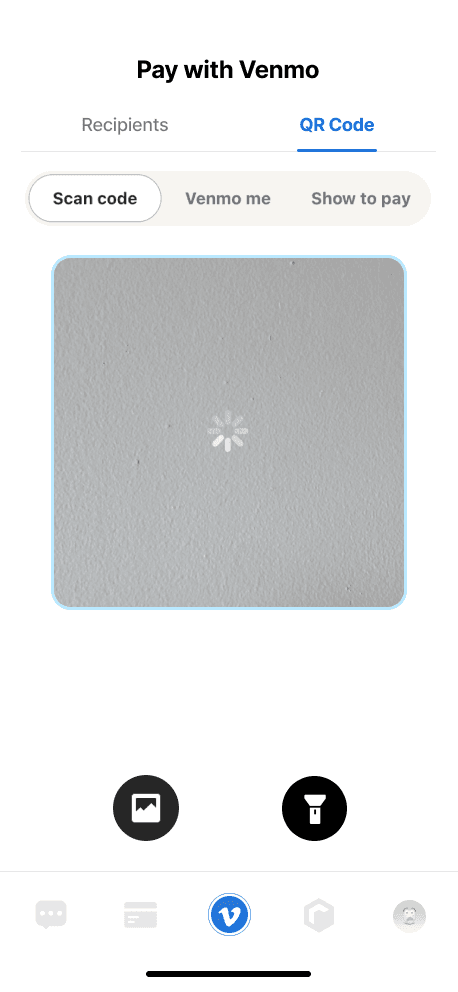
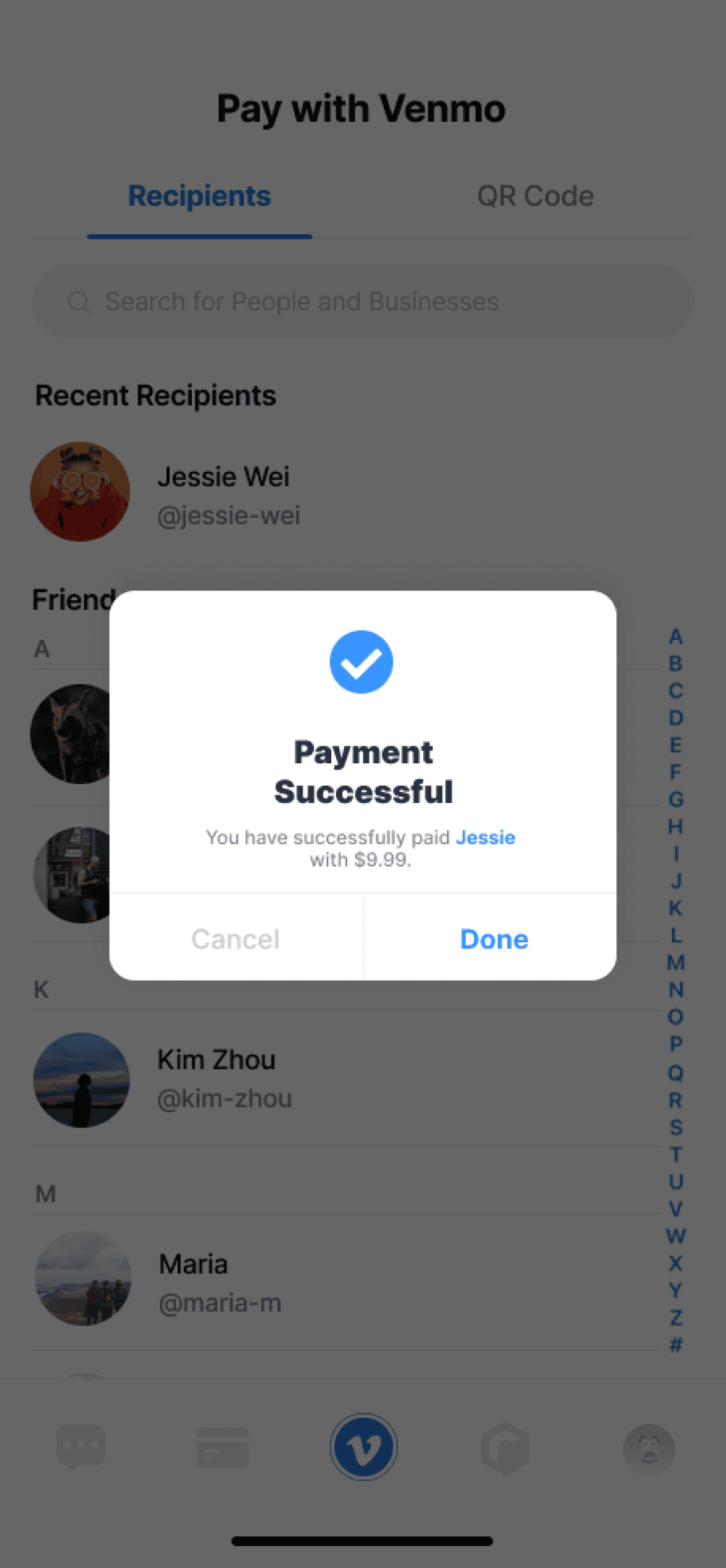
As for payment recipients, I separate this page with the QR code by adding a tab bar at the top. Users can switch between scanning the QR code and adding recipients from contacts.
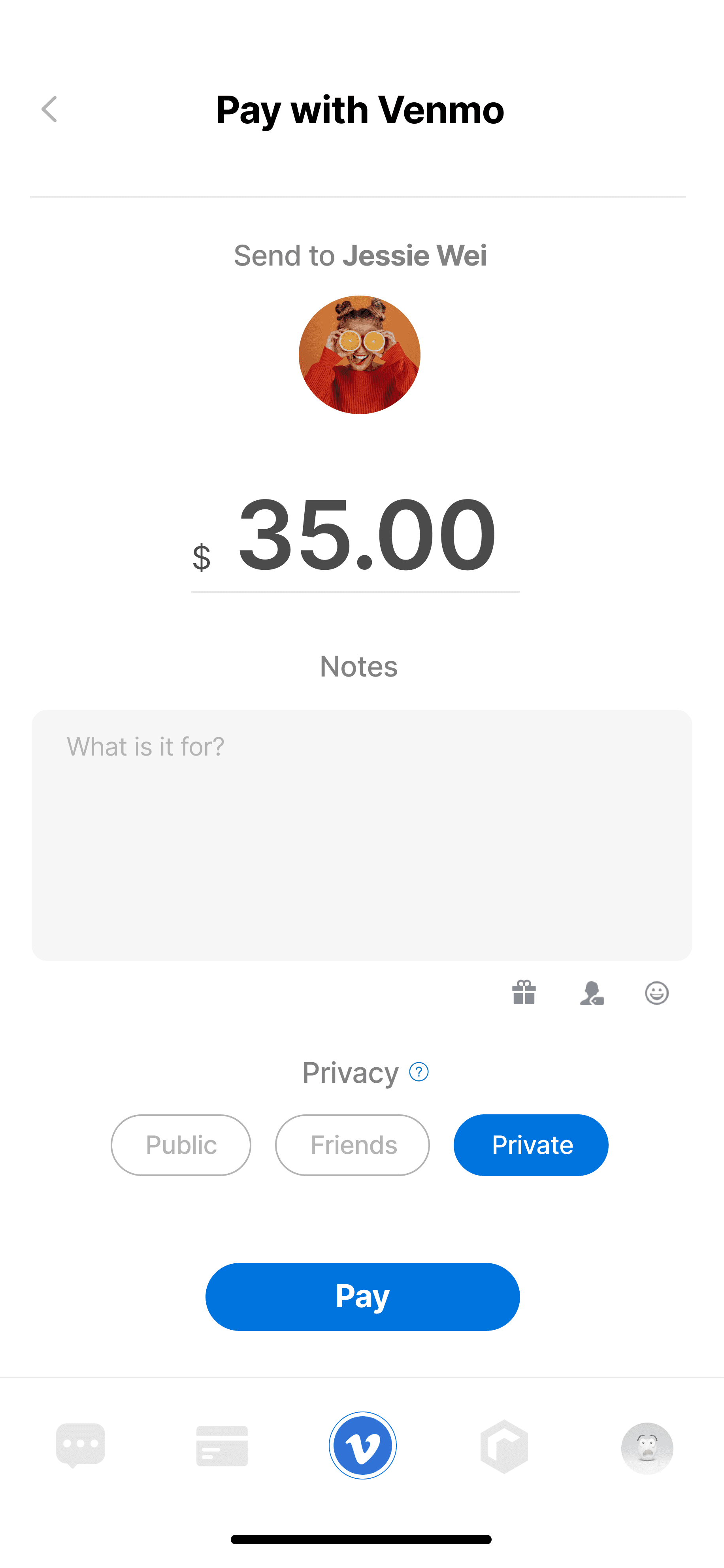
The Pay with Venmo Page is redesigned in the following aspects:
The number of transactions is designed to be larger.
Users are not forced to enter a note at the payment stage.
The button to change privacy is much more noticeable.
Payment Use Flow
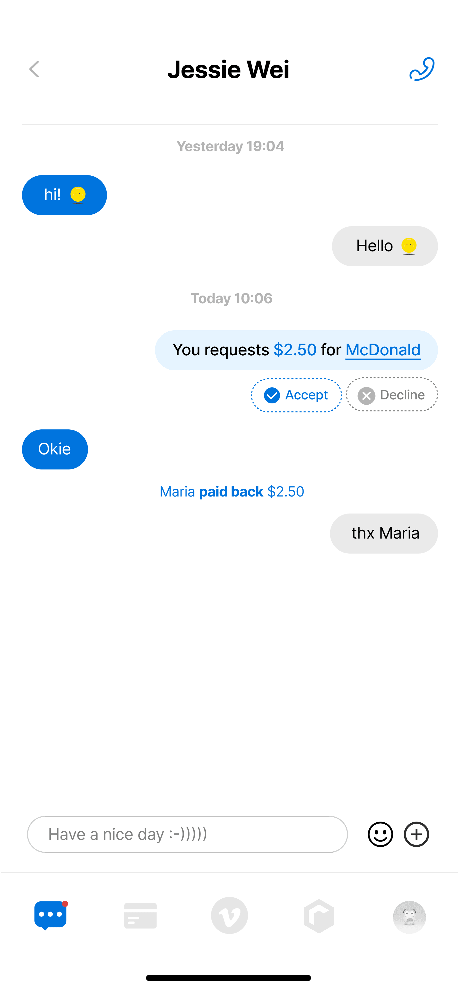
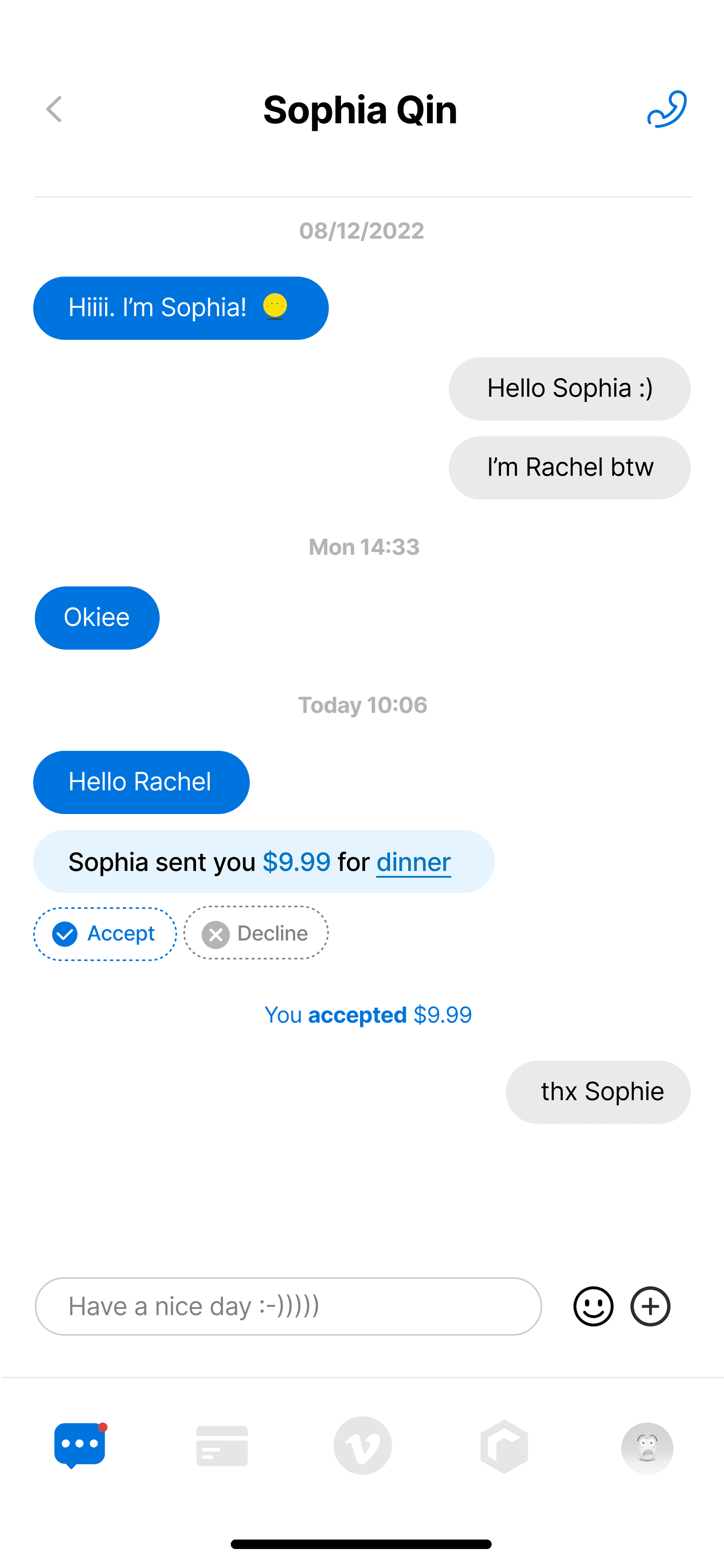
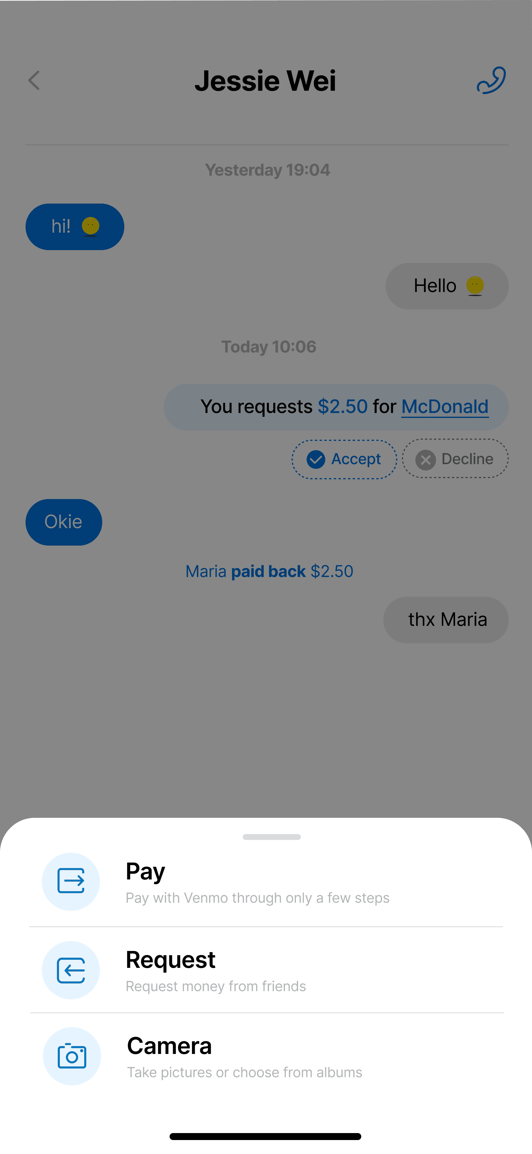
Message is a brand-new feature that allows users to chat and make transactions through messages.
Users are able to pay, request, and chat with friends on Venmo with only simple steps.
Users can choose to decline transactions if it is happened by mistake.
Pay in Chat
Prototypes


Experiments: I have two designs of paying/transferring money to friends, so I need to test them out to see which makes more sense
The hierarchy of information for paying/transferring money to friends
The layout and fundamental interactions
Whether the style and details consistent with the existing one
Goals
Who needs to participate in your prototyping sessions?
Venmo current users
People who use other online payment apps more often
What tools/materials do you need to assemble the prototype test?
I use Figma as my primary tool for designing and testing prototypes
Where will you conduct this test?
Since the prototypes I created were digital, I found the in-person testing more efficient and easy to conduct
Plans
Validation
Positive
Question
Negative
Idea
The overall experience for payment/transaction is more intuitive
The hierarchy of information is clearer
The new style is consistent with the existing one
It’s hard to understand the difference between “Mute” & “Hide”;
The Pay button is a bit small for elderly
The gift icon on the payment page is still confusing
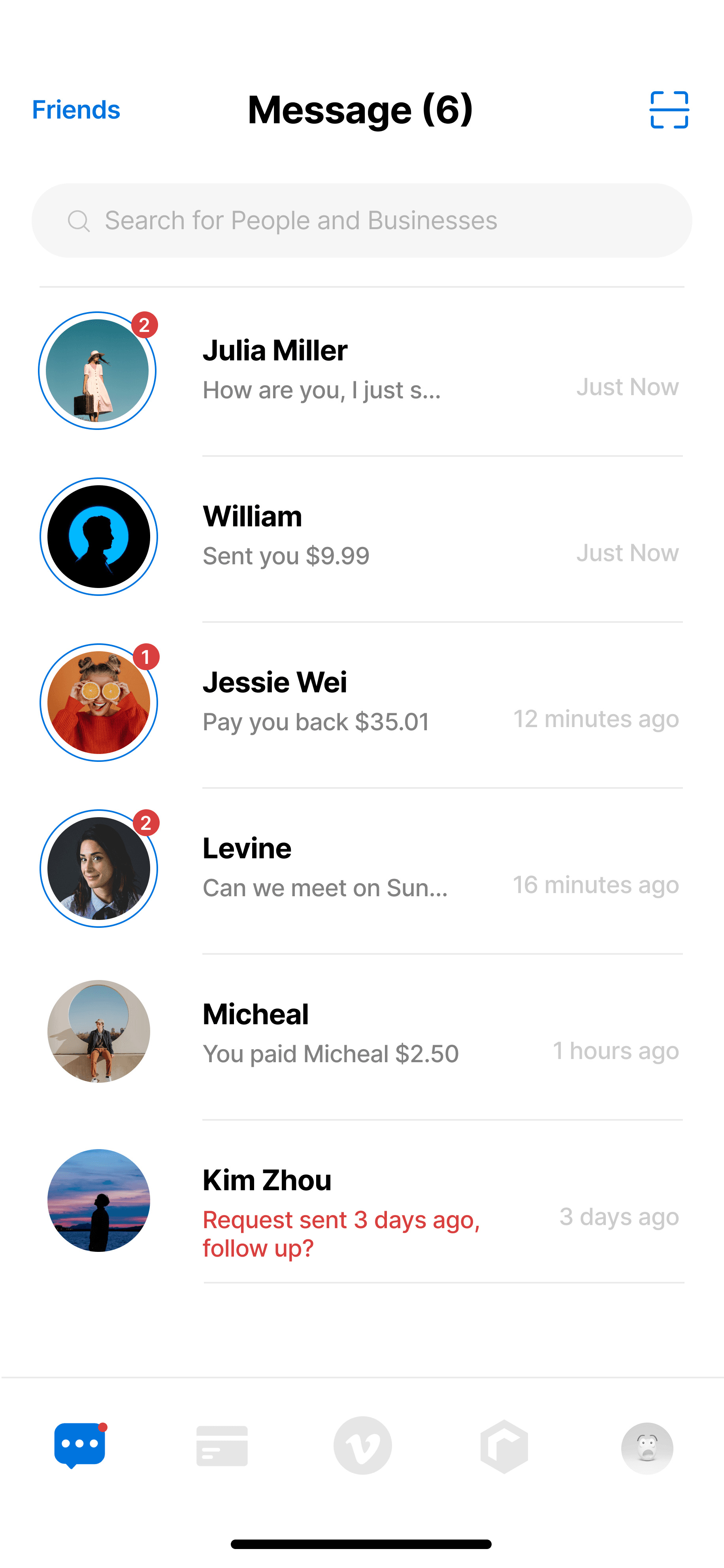
The message notification: use red dots for people who didn’t pay back the money
Use “Mute others” and “Hide my post” instead of “Mute” and “Hide”
Use icons instead of text
“Add Recipients” is confusing: Does it mean adding recipients to pay or something else?
“Request Sent 3 Days ago, follow up?” is unclear: Does it mean by your or others’ requests?
Feedbacks
Relationship
Easier for users to manage the transaction relationships with friends/family.
Accomplishment
Finishing the transaction itself would create a sense of accomplishment
Positive Emotion
Providing a convenient payment experience that will create a more comfortable/enjoyable feeling.
Engagement
When users try to finish all the tasks during the transaction, they will feel engaged and fulfilled
Impact
Thank you for visiting👋🏻 Copyright © 2025 Jinjin Du, All Rights Reserved